Brief Background
John Keells IT is the newly established technology arm of one of the country’s most loved conglomerate brands; John Keells. This division marks the brand’s entry to the digital driven business landscape with the vision of becoming the premiere digital transformation solution provider in the region. With the new identity, the brand wants to communicate the ground-breaking, disruptive nature of the ideas and the limitless possibilities that are generated from their cutting-edge solutions.
Research & Insight
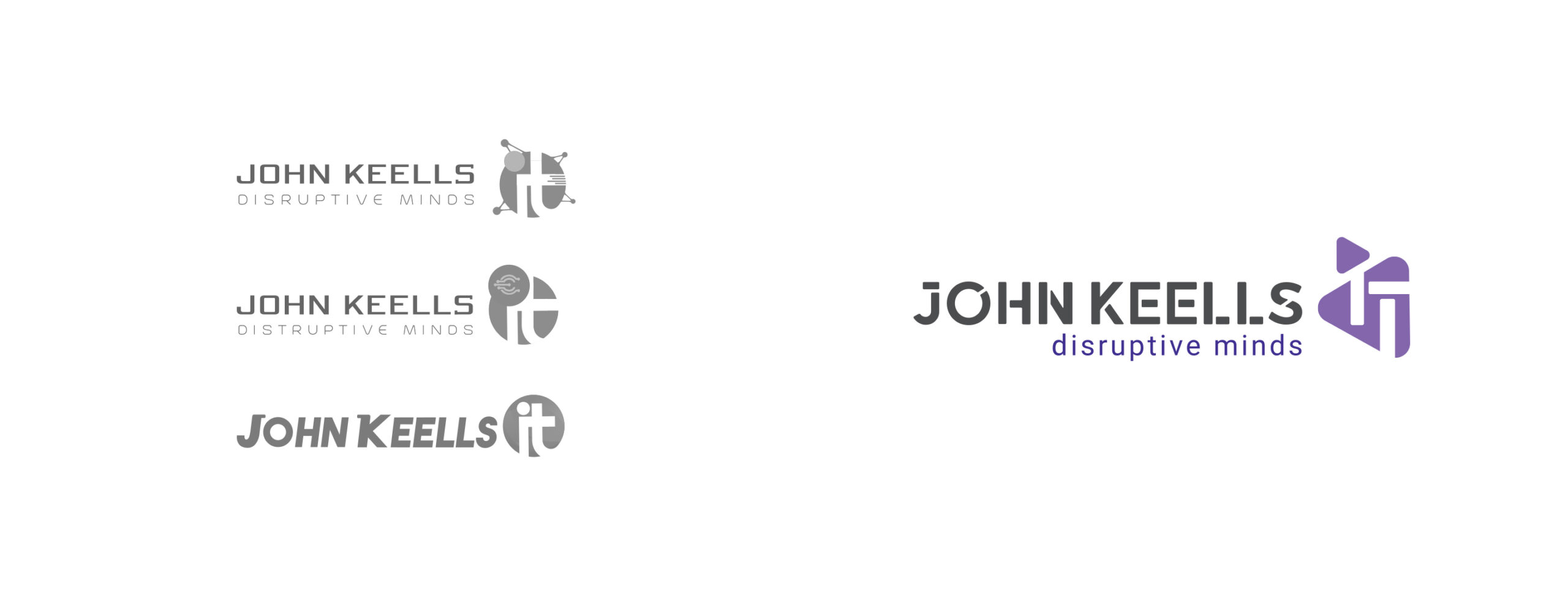
From our extensive research to other similar brands in local and international landscapes, we managed to narrow our thinking to a wordmark-based identity system with a unique brand element where the identity system has the freedom to be adopted into various forms and sizes without losing the legibility and integrity. We also considered the identity’s responsiveness when using it in both print and digital environments.
Design Approach
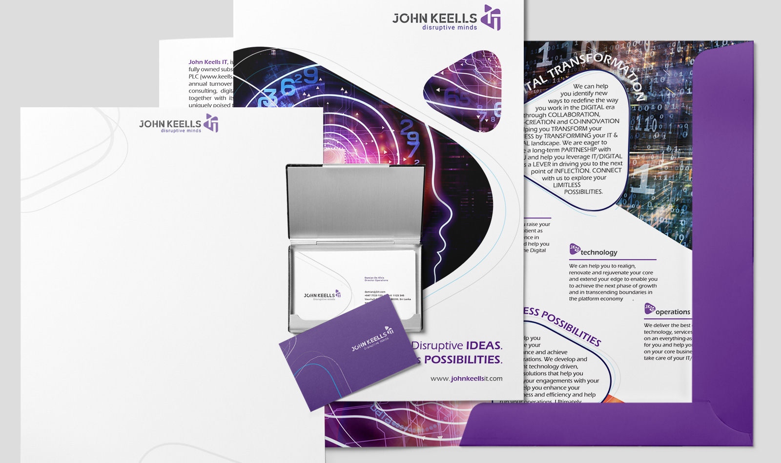
A distinct wordmark using a custom manipulated font and round edge triangles with opposite sides have been created as the brand element to signify the brand’s core 3Cs principles; collaboration, co-creation, and co-innovation and the dynamic and responsive qualities. Using the new wordmark, brand element and colour palate, other identity usage variations are also developed to show the adaptability of the identity system.


